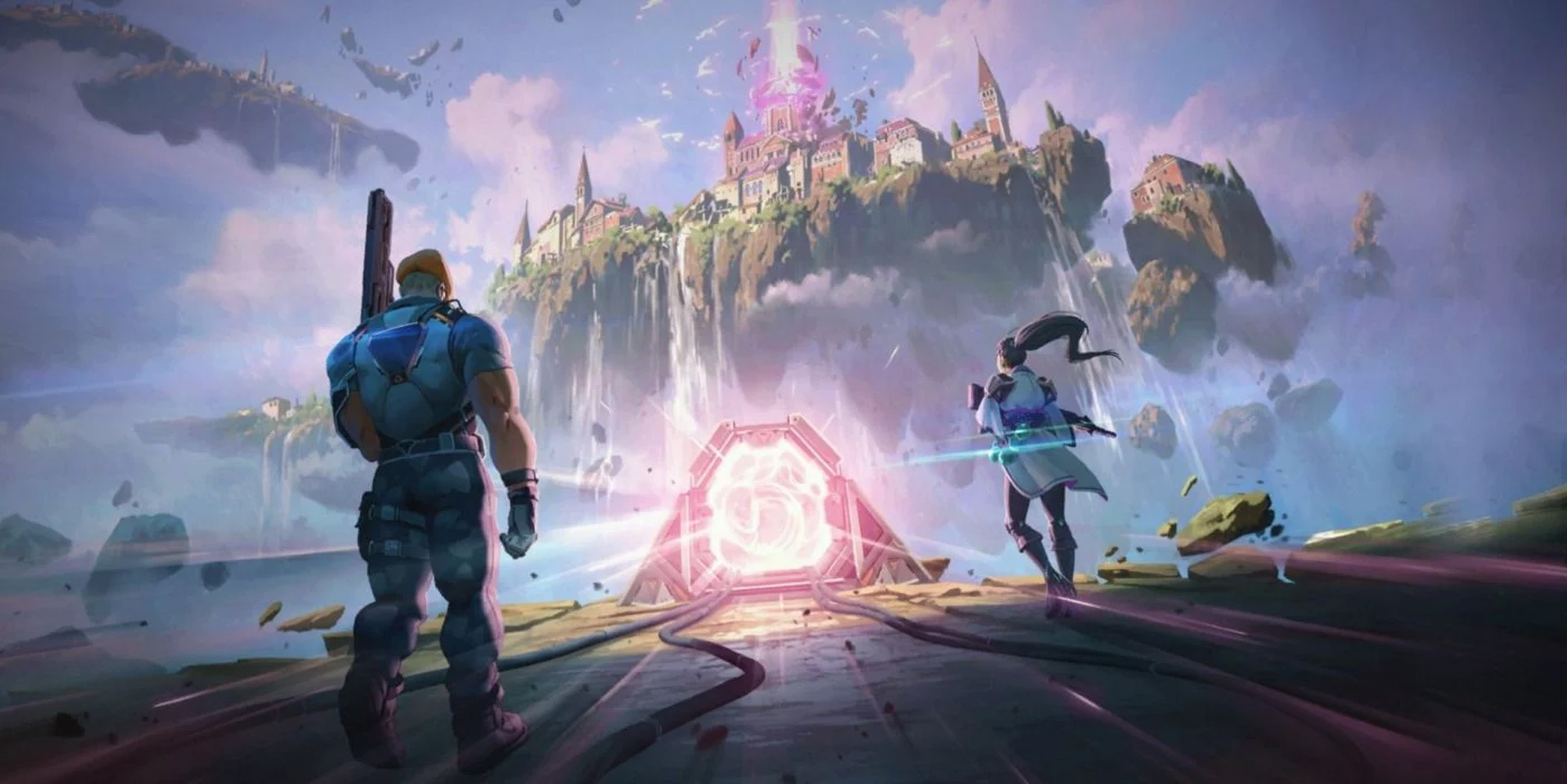
The presentation team at Riot Games invited me to join them for a little white in order to help with the graphic + motion design direction for their first tactical first-person shooter Valorant. This involved menu screens, in game graphics, iconography and the landing screen for the game. Below are a few examples of the many designs I had the privilege to create while at Riot.
BELOW
Early on the project, the idea of having magic as ambient animation throughout every screen was brought on.
One of the first tasks I had to tackle was to come up with the look and feel for said magic. We wanted to have a heavily stylized look for it while keeping realistic physics. These are some early explorations for the magic vfx.
BELOW
Apart from designing layouts my task was to come up with the look & feel of the animation for the menu screens. I wanted a snappy and fluid feel for the transitions and reveals while keeping each animation to a maximum duration of 1-1.5 seconds. The reason being that experienced players were going to spend quite some time on these menus navigating through different sections. Their experience needed to be a fast instead of being slowed down by pretty looking but longer transitions.
Apart from designing layouts my task was to come up with the look & feel of the animation for the menu screens. I wanted a snappy and fluid feel for the transitions and reveals while keeping each animation to a maximum duration of 1-1.5 seconds. The reason being that experienced players were going to spend quite some time on these menus navigating through different sections. Their experience needed to be a fast instead of being slowed down by pretty looking but longer transitions.
BELOW
Killbanners.
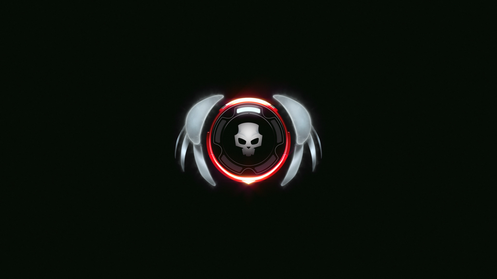
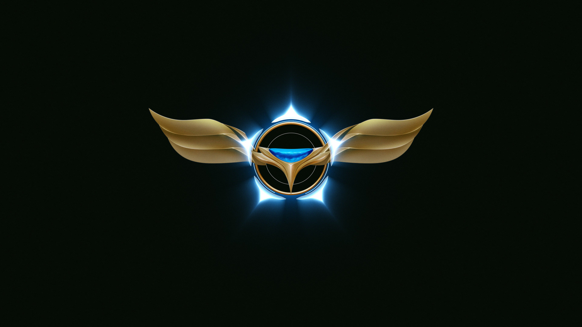
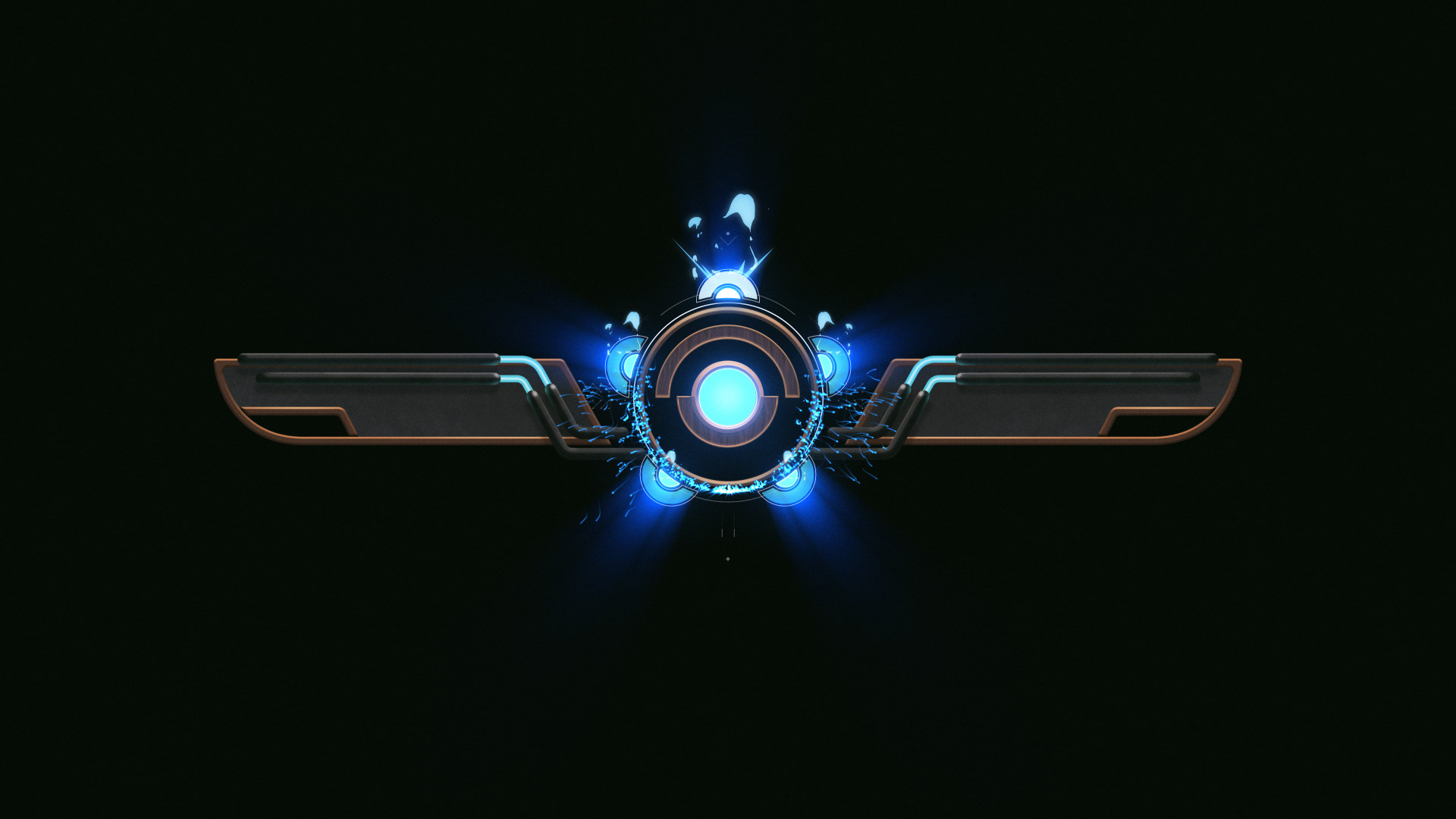
The team needed a visual to communicate confirmed kills -1 to 5- without using numbers and in a way in which the visuals could be customized with different skins while keeping the same visual communication system. On top of this, the visual had a max. screen time of 2 seconds. My solution for this was a simple "revolver-like" graphic that could indicate kills by filling 5 slots. This can be skinned in any way since the key elements are always on the same position.
The team needed a visual to communicate confirmed kills -1 to 5- without using numbers and in a way in which the visuals could be customized with different skins while keeping the same visual communication system. On top of this, the visual had a max. screen time of 2 seconds. My solution for this was a simple "revolver-like" graphic that could indicate kills by filling 5 slots. This can be skinned in any way since the key elements are always on the same position.
BELOW
Early explorations for the killbanner graphic.
BELOW
HUD, arsenal and loading screen design + layout.
BELOW
Early explorations for end of match graphics. These would be super imposed on top of the game.
BELOW
Exploration for rank progression.
BELOW
Icon design.
BELOW
Magic exploration for in-world icons.
BELOW
Having the opportunity to come up with the first thing a player will see when starting a new game is always exciting.
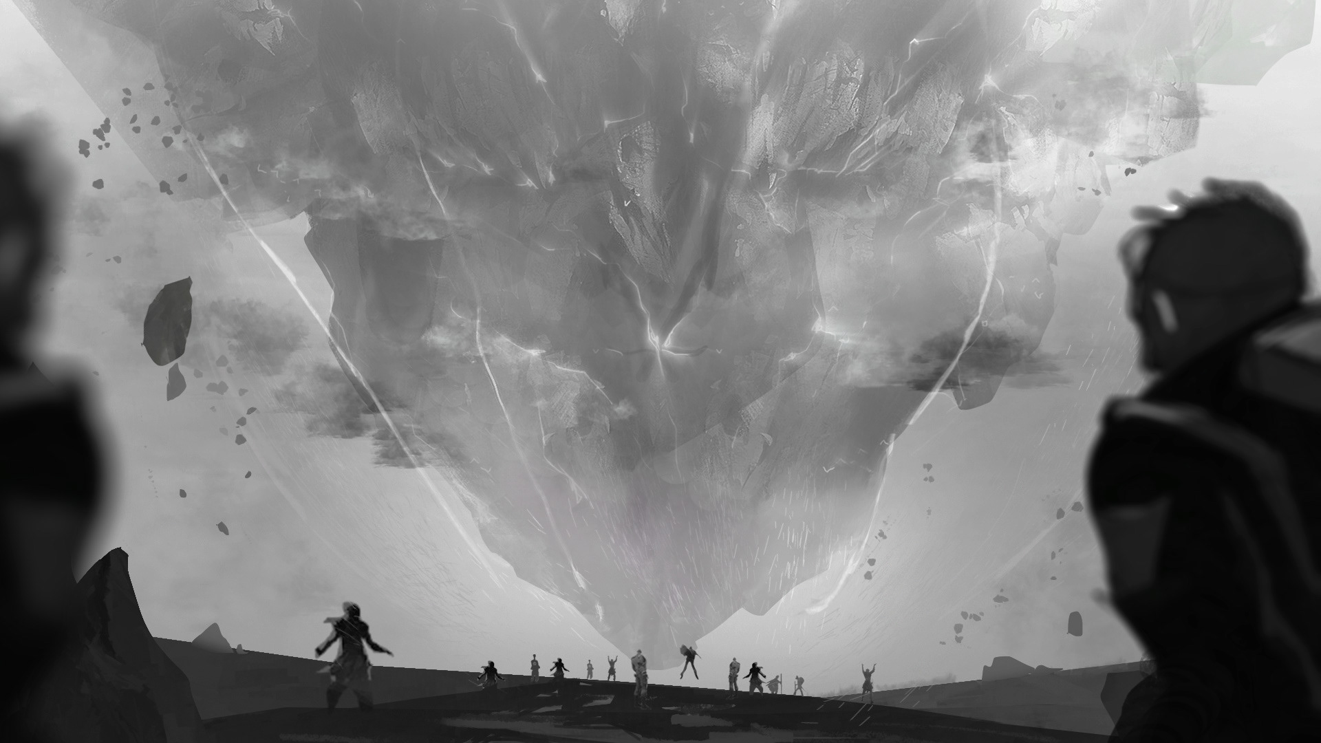
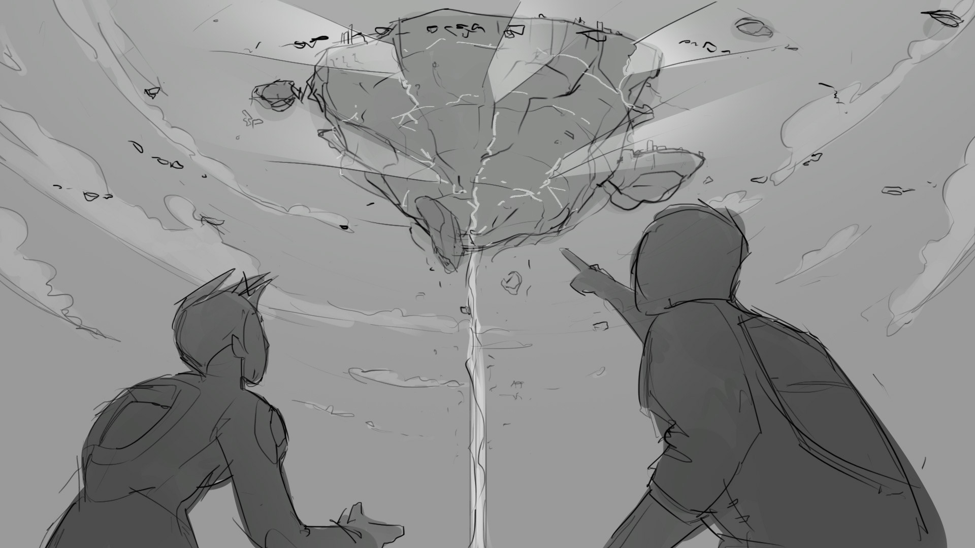
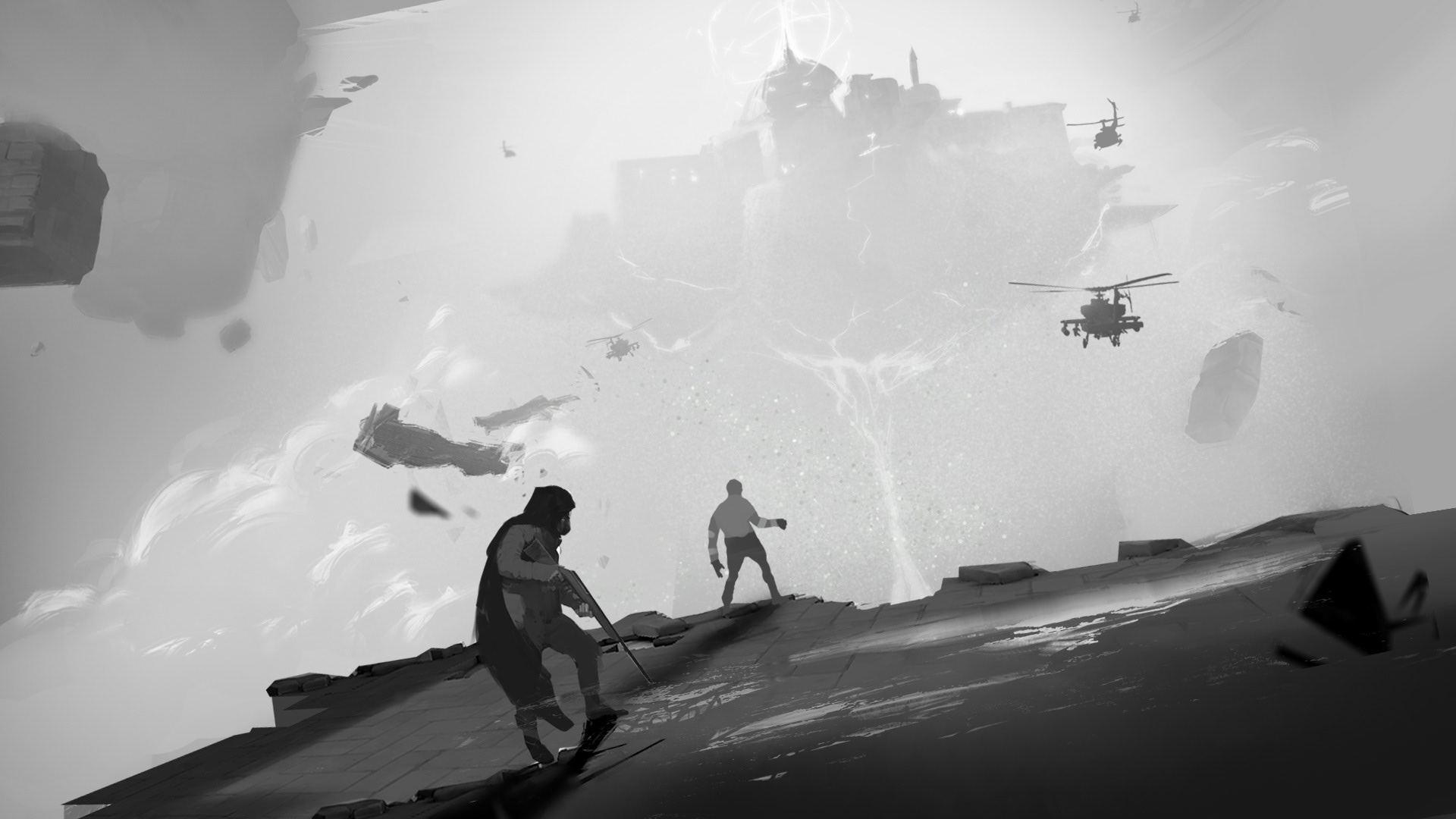
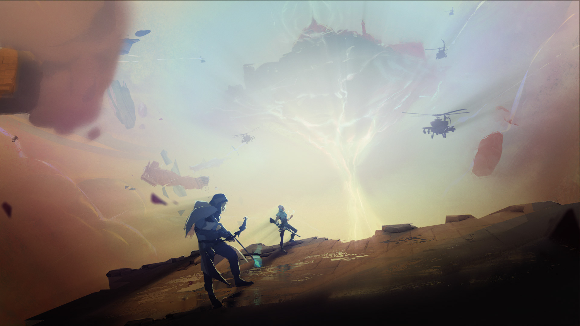
The brief mentioned that it had to show a couple of characters, magic vfx and the floating map of Ascent. I came up with a couple of compositions (images 1-4) and this was then given to the concept art team in order to create the final key art (image 5).
